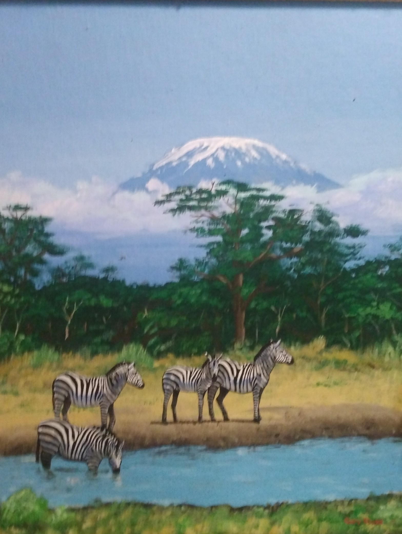
According to Gary Alan Ruse, the painter, he created this painting from memory after seeing a photograph. While cleaning, I found the painting and liked it immediately. After some dusting, I found it intact, even though there was some damage to its frame. Hirsh at Rosemont gives a lecture on understanding art that inspired me to look at Zebras Grazing Before Mount Kilimanjaro in a new way. Her lecture on color guided me on generating a deeper response to the painting because, although I understood intuitively that the painting was calming, her discussion of how artists manipulate color showed me why.
Ruse uses color expertly to create a feeling of calm in the scene. The painting is of a family of zebras. There are three adult zebras and one smaller zebra peacefully grazing near a watering hole. Behind them rises the rounded peak of Mount Kilimanjaro. The mountain seems to protect them like an older family member. Most of the colors are cool colors like blue, teal and shades of green. Even the warm tan of the grasses is interspersed with tufts of green. The white and black of the zebras are surrounded by a rounded frame of forest green in the trees. Because of the Hirsh lecture, I see now that this use of cool colors has the effect of calming the viewer. It seems completely intuitive. This was the reason why when looking at the painting, I felt calm.
Ruse varies the intensity of the color in another way with the shades of blue. The blue of the water is mixed with white and other colors to create the representation of sunlight on the water as well as the reflection of the zebra’s face. Similarly, dark colors are used as shadow to indicate the position of the sun as well as to add dimension and fullness to their bodies. The clouds have an added pink color to suggest a refraction of sunshine also. But the best use of color is the way that the dark green contrasts the blue of the mountain. It almost enshrines the zebra family like a cameo from the vastness of the uninterrupted sky.
So, it’s no wonder that my response would be positive. I felt pleasure while admiring this painting because the cool colors were soothing. The use of color did not jar me with any unwelcome surprising clashes. The varying intensity of the blue created a meditative feeling. Finally, the saturation of the blue made the mountain friendly. It was not really intense blue, but it was like a soft light color, almost like powder blue. I have seen mountains that were sharp, jagged and icy. They communicated danger, but in this painting the mount’s color suggested that it protected the zebra family. Color was used with heart to make this painting soothe an aching heart, and I thank the artist.
