Marcelle Zanetti is enjoying an exhibition of her work. Her beautiful and colorful paintings of breathtaking natural wonder are on display for Miami’s art enthusiasts.
In Coconut Grove, she and Elizabeth Britten are displaying their work with the exhibition title of Two Woman Exhibition at Grove Gallery which is located at 2884 Bird Avenue.
A versatile artist, Zanetti uses her large paintings to highlight the extraordinary beauty in the minuscule. For example, her painting of pond lilies, Everglades Series 1 – Lilies, features lilies floating in a pond with tiny droplets. They seem to be dazzling and shining with almost palpable moisture from the pond. The painting measures 40” by 60.”
Other examples of the detail she painstakingly adds to her works of realism are pictured here. Lake Murray I and Lake Murray II show her skill in meticulously arresting attention and fixing it onto the images of stones and rushing water.
For more information visit http://www.marcellezanetti.com to learn more about the artist and this and her other exhibitions in Jupiter and the Village of Palmetto Bay.
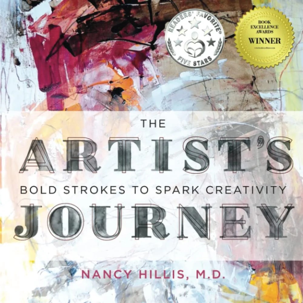
The Artist’s Journey is not an instructional manual for technique, nor is it a biography of a specific artist. This book discusses what goes into freeing the mind from inhibitions to tap into the inner source of creativity.
Hillis is a trained therapist who worked with existential psychology for years before the art bug caught her. She helped many people and uses this experience within the book.
It is structured in different parts with each containing an exercise that will help guide down into the core of the artist with the goal of bringing authenticity to the artist.
It assumes some experience as an artist and skill in the chosen medium. Most of the exercises center around painting.
Personal response to The Artist’s Journey
Responding to this book was relatively easy. I enjoyed the writer’s style and ability, liked the organization of the content and agreed with her philosophy.
I especially liked the exercises. Although I am not a painter, I used her techniques with my writing to great effect. The first exercise for example centered around drawing a mind map surrounding the word “ugly.” I used it to write an essay about the emotion of sorrow which I find to be “ugly.”
She reminds us in this section that the term “ugly” has a meaning that changes over time and from person to person. “Sorrow” has been the subject of many paintings. They are beautiful, but to me, the contortions that sorrow performs on a countenance leave it strained and sometimes grotesque.
This painting by Cezanne always makes me think of the sorrow in a tragic relationship. It is called Pierrot and the Harlequin (1888)..
Connections with other books and philosophies
When I first started reading this book, I kept recalling The Artist’s Way by Julia Cameron. It is a different book because of its back story. While Cameron came to the writing of what is transformative text for artists through happenstance and personal trial, Hillis did so for other reasons. Cameron was a successful screenwriter while Hillis was in the medical profession.
Another connection came from the ideas about freedom that I talk about with my husband. He is a painter and successful author. He says that many times, he pursued projects that interested him for the love of writing and abandoned his particular genre. This made it difficult to market his work, but led him to feel free. Feeling free leads to better art.
Finally, I enjoyed her references. She cited quite a number of influential thinkers. Clarissa Pinkola-Estés, Carl Jung, Joseph Campbell and Shakespeare to round out the list. She had numerous references to music, film and books that placed her squarely in the middle of the grand conversation surrounding art and its making.
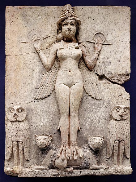
The Burney Relief, or “The Queen of the Night” fascinates the viewer because of the symbolism used in the sculpture, its odd history and the myths surrounding its subject. Seeing this female figure standing on the backs of lions and holding out her arms from her nude form with strength and vitality reminds one of power and integrity, courage and vigor.
Timeline
Imagine being transported to the faroff time of 1750 BC. You are in the bustling kingdom of Babylon under the rule of King Hammurabi and the Gods of Heaven reign supreme.
In the book of Revelation, according to Dr. McDonald, Babylon is supposed to enjoy a reputation in the modern world as the abode of harlotry and depravity. “It is cursed by the Bible.” Dr. McDonald says that “examining the history reveals quite a different picture.”
The home of this sculpture was the place where the law code of Hammurabi, which is in many ways the basis of modern law, was created. People there were supposed to respect the Gods and their priests and rulers.
The King himself said that he ruled under God and was therefore a subject himself. He was said to have conquered all of the Near East and ruled effectively until the time of his death.
Hammurabi formed the kingdom of Babylon with the goal of ensuring the happiness of the people. As Dr. McDonald discusses, under his rule many improvements were made to the infrastructure which made living better for his people. Although a warrior, the King brought peace and stability to the people in the kingdom.
The Sculpture
The sculpture is full of symbolism and strength..
Burney Relief at British Museum
The figure is of a voluptuous female with a curvy body and symmetrical features. Her breasts and hips depict youth and health as they are full and round. She has smooth skin which also points to health.
She has animal features, too. Her down turned wings resemble those of a predatory bird and to complement this she has bird feet with talons that could tear open a victim.
According to the British Museum website, she has many accessories that support the idea that this sculpture is of the Goddess. Her headdress symbolizes her divinity, and her bracelets and necklace suggest great power.. Also, the rods and rings in her hands symbolize justice which means that she is powerful indeed.
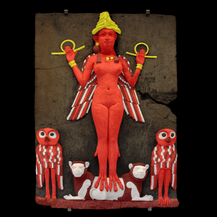
There is some paint residue on the sculpture so experts have been able to determine what it might have looked like. This picture describes that theory. Dr. McDonald presents a similar rendering in her lecture.
Painted sculpture
The high relief sculpture (which means that it was moulded so that the figure’s features extend outwards from the surface) is made of straw tempered clay. That means that the clay was mixed with straw to keep it strong and firm.
It measures 20 by 15 inches. Some experts, according to McDonald suggest that it could have hung in a bordello, but other sources at the British Museum say that it could have been made to hang in a shrine.
Either way, wherever it was placed, it commands attention. The lions were used by the Babylonians to accompany Ishtar. The owls were tied to the night. The small platform is supposed to mean the mountains which according to recognized experts was the home of the Gods.
Controversy
Is it Ishtar or her sister goddess?
Some say that this sculpture is not of Ishtar but of her sister who is said to rule the underworld. McDonald makes a great point that the Babylonians didn’t make sculptures of demons or this type of sculpture of demons, so it doesn’t seem to be her sister.
Then, Ishtar was always shown with lions. Her standing on the backs of these lions in a non-threatening way implies that these are her lions. Her talons do not scar or injure the lions but only stand on them.
Some experts say that the fact that the wings turn downwards mean that she is the sister because they symbolize the underworld when placed that way, but according to the Brooklyn Museum’s research on myths surrounding Ishtar particularly their work on Gilgamesh reference the myth of her descent to the underworld with her lover Dumuzi. It is reasonable to think that it is Ishtar within that narrative space.
Is it authentic?
Another controversy surrounding this sculpture focused on whether it was even real. All sources indicate that thermoluminescence testing revealed it’s authenticity in 1933.
This type of dating uses radiation to determine the age of pottery. It examines the material’s composition to pinpoint when the clay was subjected to heat in order to create the sculpture. The British Museum performed this test in 1933 and judged it authentic from the Old Babylonian Period.
Related Works
Two related works exist: one is at the Louvre and the other at the British Museum, too.
There is a vase at the Louvre with another depiction of Ishtar. On the vase are drawings of birds and fish. Ishtar is shown on it with similar birdlike feet but there they are not as finely rendered.
Also at the British Museum is a “small, crude plaque” with a goddess depicted with down turned wings and the crown of divinity. It is also clay.
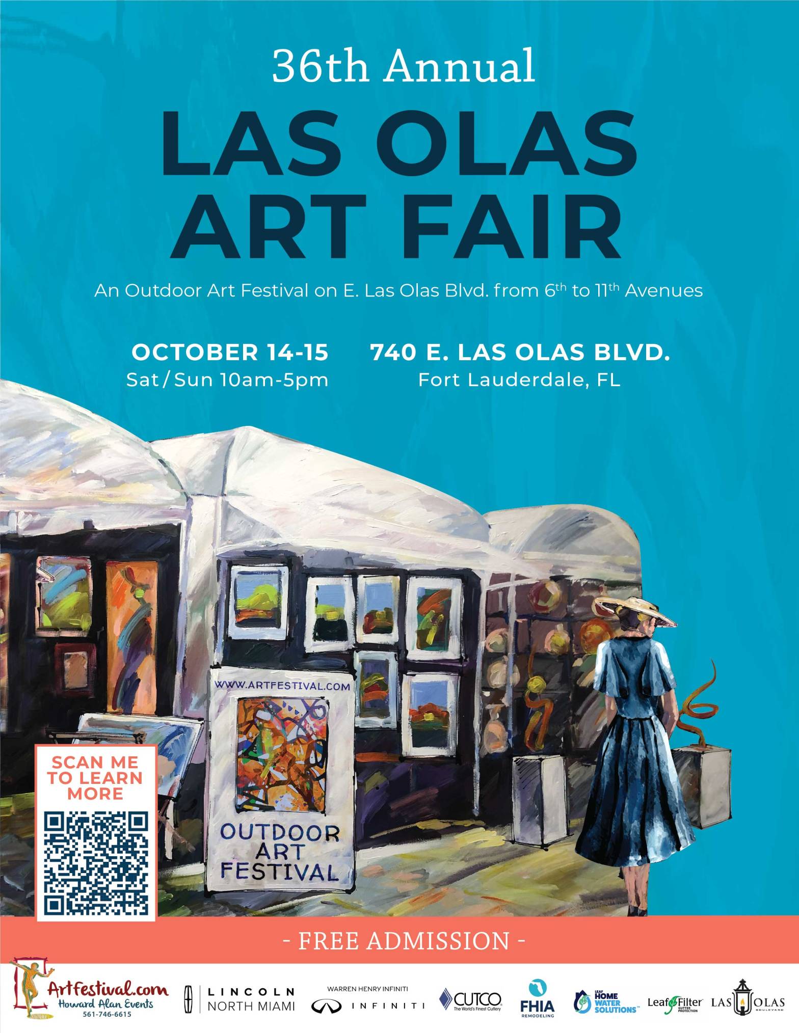
On the weekend of October 14, 2023, the 36 th Annual Las Olas Art Fair came to the “Jewel of the City” of Fort Lauderdale as Las Olas Boulevard is called. The juried art fair featured artists like Alfred Addo, Tali Almog and others. Artist Tony Mendoza, was among those accepted and showed his work to an appreciative crowd. He said that he had a positive experience at the fair.
The fair was established by promoter Howard Alan. The art fair attracts quite a crowd.
As mentioned, the Las Olas Art Fair is a juried exhibit which means that artists and crafters have to apply and be accepted to display their works, so it is nice to see Mendoza there representing Miami!
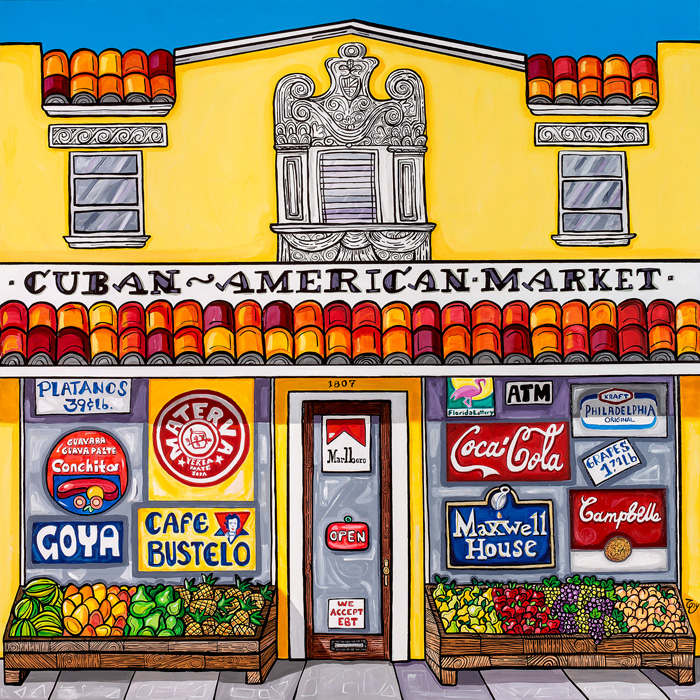
Mendoza’s work is interesting because of its comic sense and dazzling use of color. His work is never dull as it reaches for excitement and finds it in color and verve. While I was reading about color theory, I saw how complementary colors align, creating vivid contrasts of orange and blue while triadic colors blue, yellow and red tend to surprise. Immediately, I thought of Mendoza.
His painting, “Cuban American Market,” has the blue sky right next to the orange tiles on the roof of the market. Then, the placards on the walls of the market have an arrangement of the triadic choices. For example, the Maxwell House sign, Coca-Cola sign and the Lotto used blue, red and yellow respectively. Also in the tiles on the roof, analogous colors, orange, yellow orange and red orange create harmony in the painting. The colors in this painting were as close to theory as could be which really shows a respect for the wheel.
At The Fair
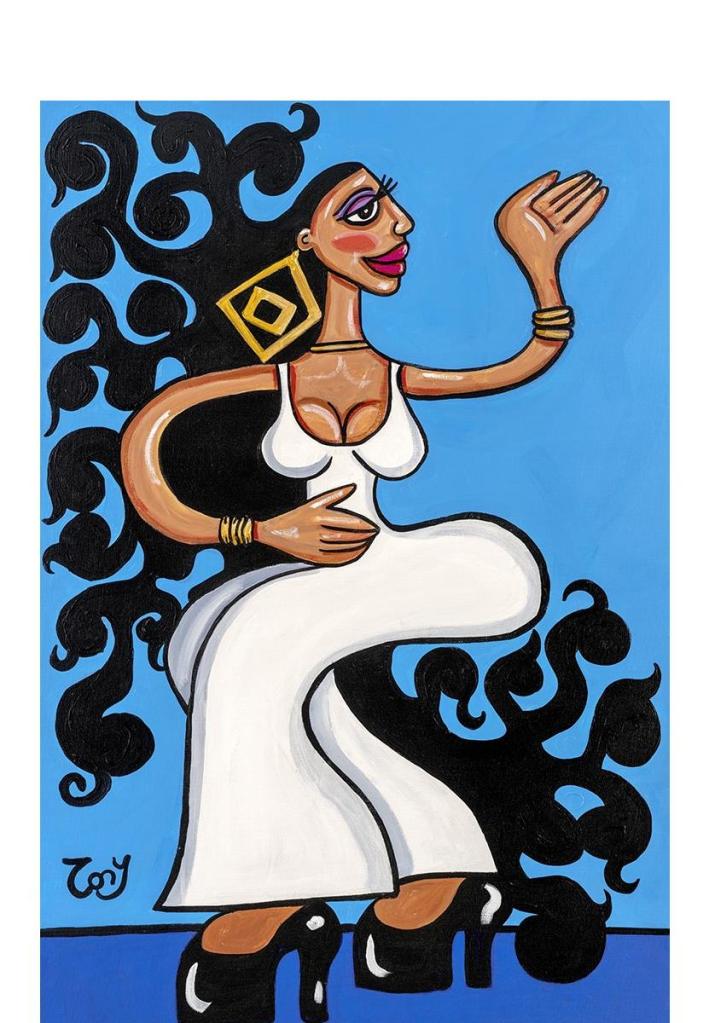
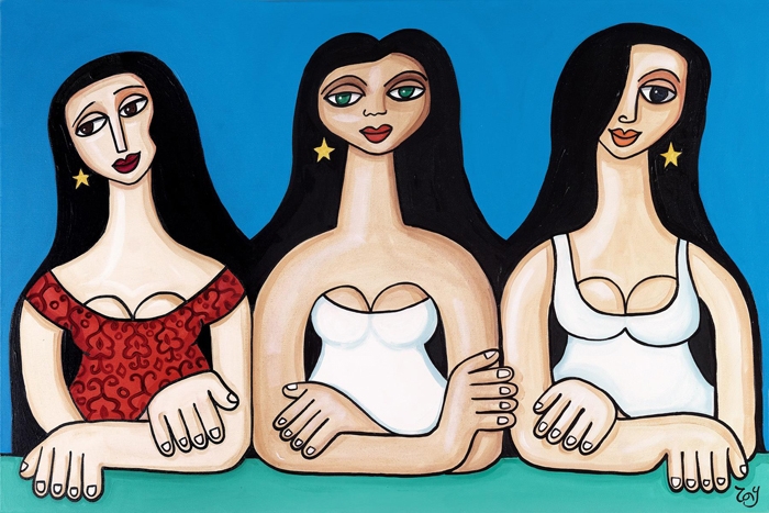
Among the paintings that he chose to display were “Malas Lenguas,” “Tres Marias” and “Tumbao.” I like “Tumbao” because I really like Celia Cruz, and Mendoza said that it was inspired by one of her songs. I like it also because of the drama in the work. The piece depicts a voluptuous woman with long hair in a white dress against a solid blue background. Her hair has so much movement! Tumbao is Cuban slang for chutzpah or spirit.
“Tres Marias” shows three women who are very similar in appearance. Their expressions capture wistfulness, directness and compassion. The three Marys or Tres Marias seem impassive but caring as if they see our suffering and wish that we would not have to experience it but recognize the inevitable nature of it. The Mary on the right even looks somewhat humorous as if watching a precocious child play. I really like that piece.
Tony Mendoza liked the experience at the art fair. He really enjoyed his stay at the Riverside Hotel and said that he intends to return to the fair soon.
The event is for artists and crafters and accepts applications. Mendoza said that it takes place twice a year.
DecoArt. “Color Theory Basics: The Color Wheel,” DecoArt Inspiration Blog, Accessed October 16, 2023. shop.decoart.com/blog/color-theory-basics-the-color-wheel/
Howard Alan Events. “36th Annual Las Olas Art Fair,” http://www.artfestival.com. Accessed October 17, 2023. Artfestival.com/festivals/las-olas-art-fair-fort-lauderdale-florida
Mendoza, Tony. Interview. Conducted by Helen Lemus, week of October 16, 2023, via email.